CR – UI Redesign
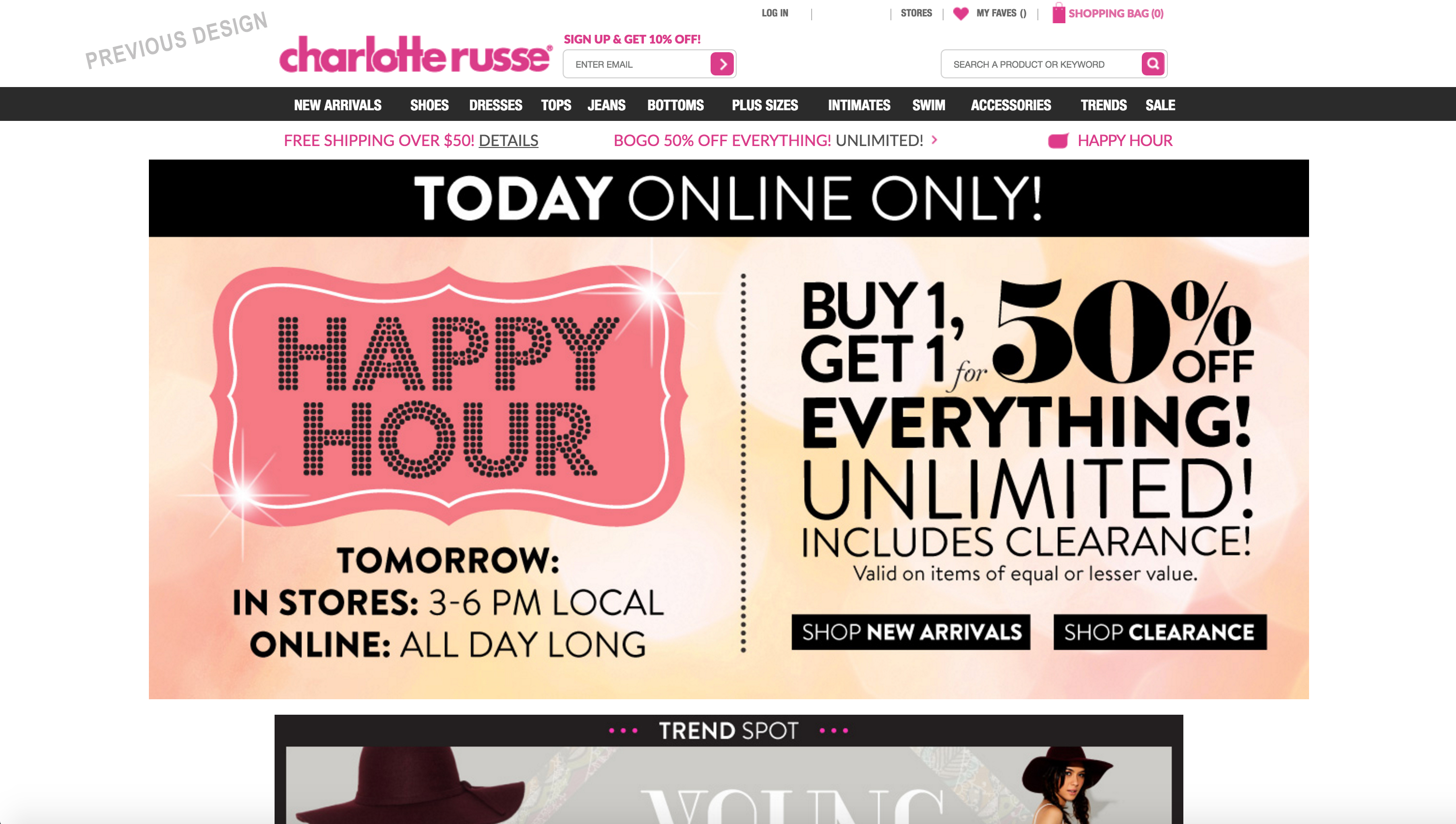
The original site had a busier navigation bar, one large slider, a trends spot showcase and a widget for Instagram.
Things we learned from doing user testing:
- Customers rarely clicked on the homepage messages, but were inspired to shop by what the saw. The previous assumption from click-through rates was that they were not compelled by those messages.
- Customers kept confusing the search bar and email signup fields. It also added a lot of clutter to the header.
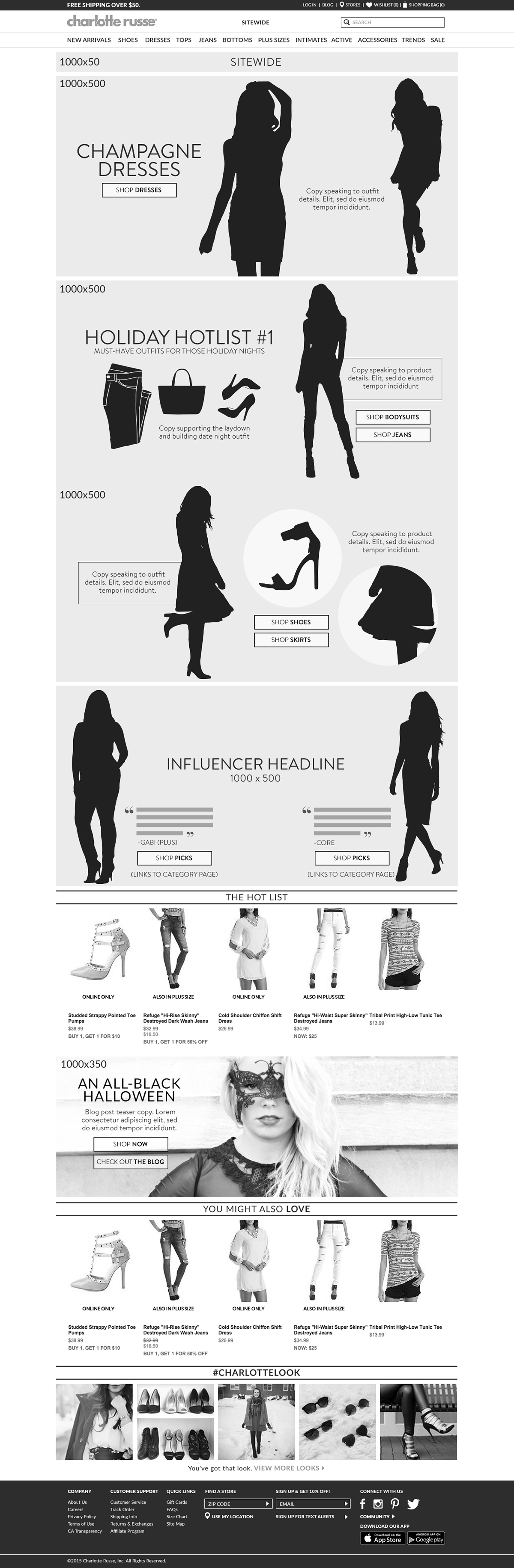
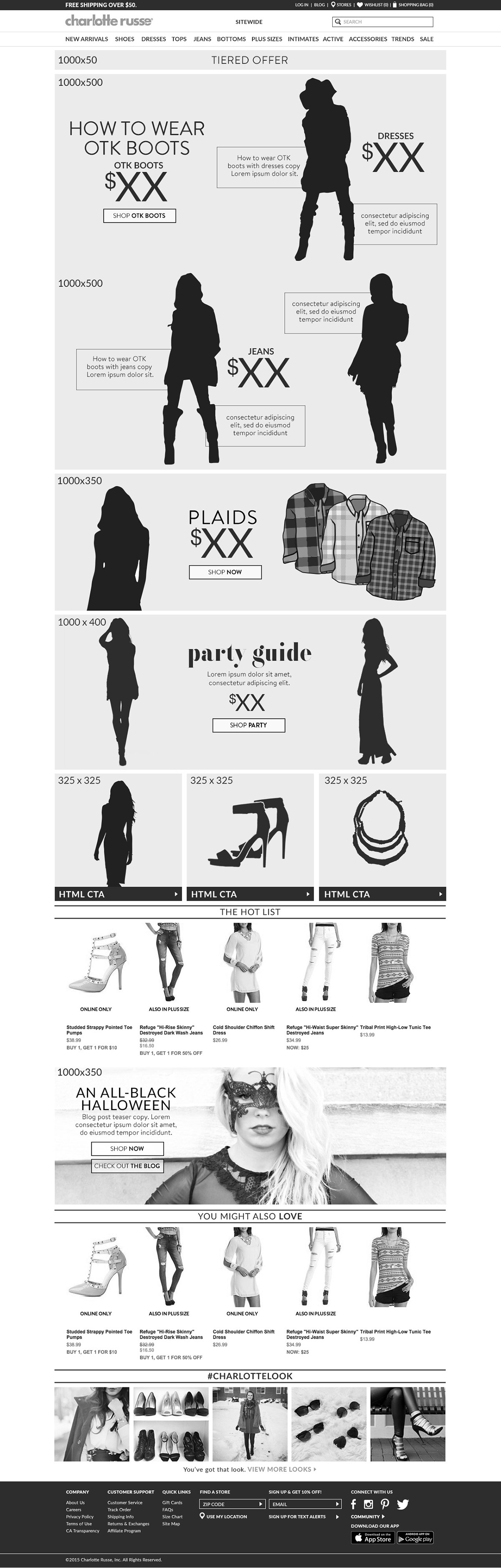
The main objective was to clean up the design and create a vertical scrolling homepage, vs hiding content in a slider. I designed content modules that allowed more flexibility to the creative team and was easier on production to develop.
I redesigned the navigation, footer and overall homepage layout to have a cleaner look and feel. We did a/b tests and post user testing to reaffirm that the lighter and more open design performed better than the previous version in a black bar.
Both designs show examples of monthly concepts created with the marketing team.
The last comp shows the original design.